Visualizations
Shiyuan Zhou
Interactive Visualizations
Stacked histograms of Life Expectancy by Expenditure Level and HDI Level
The first plot we have is the stacked histograms of life expectancy by expenditure level and HDI level. The proportion of each level of expenditure does not make a big difference across different ages. However, in the stacked histogram for HDI level, it is very clear that higher HDI level become more concentrated on the right, which is higher age. For different range of age, there always have a dominated HDI level. For example, for life expectancy less than 60, low HDI level dominates. Hence, according to these histograms, income composition of resources have a stronger relationship with life expectancy.
Barcharts for Expenditure Level and HDI Level by Development Status
According to the barcharts we have for categorical variables expenditure level and HDI level by development status, developed countries tend to have higher expenditure and income composition of resources. However, the trend between HDI level and development status is stronger.
According to the bar chart we get for expenditure level by HDI level, the proportion of low and high HDI level is the largest in the low expenditure level. The proportion of medium HDI level is the largest in medium expenditure level and also for high and very high level. Hence, we could say counties with high expenditure level have higher probability to have high HDI level. Predictors expenditure and HDI may have a linear relationship.
Statistical Summary Graph for Expenditure Level and HDI Level
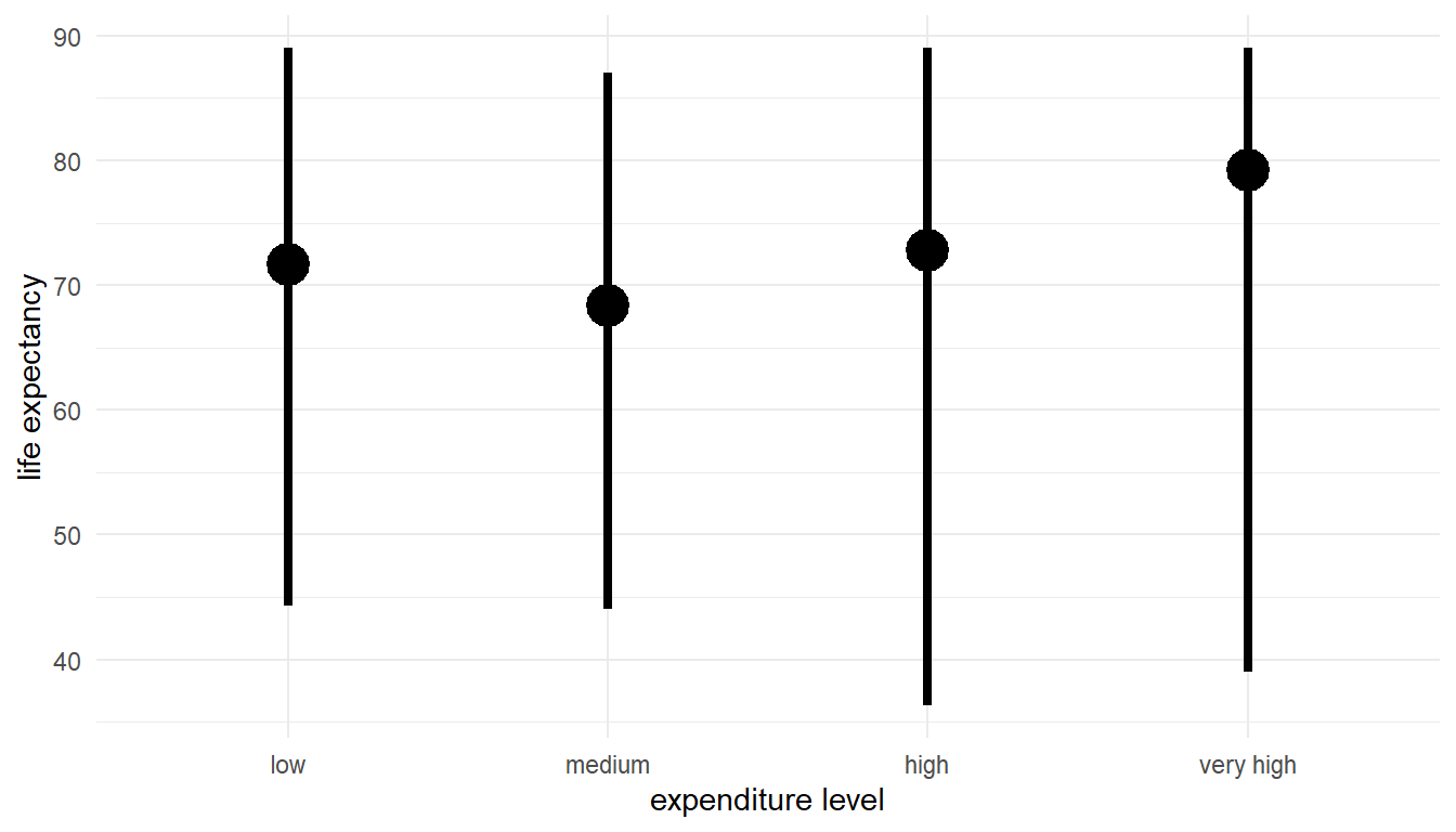
According to the statistical summary graph for expenditure level, though mean of life expectancy in low level of expenditure level is higher, we may have an increasing trend between expenditure level and life expectancy. However, if we adjusted by development status, we can see that the trend is clear for developing countries but not for developed countries. The higher mean of life expectancy in low level of expenditure was pulled up by the values of developed countries as the orange points shows. Additionally, the range of life expectancy for each expenditure level as the distance from min to max is large, which means our model may not fit tightly.
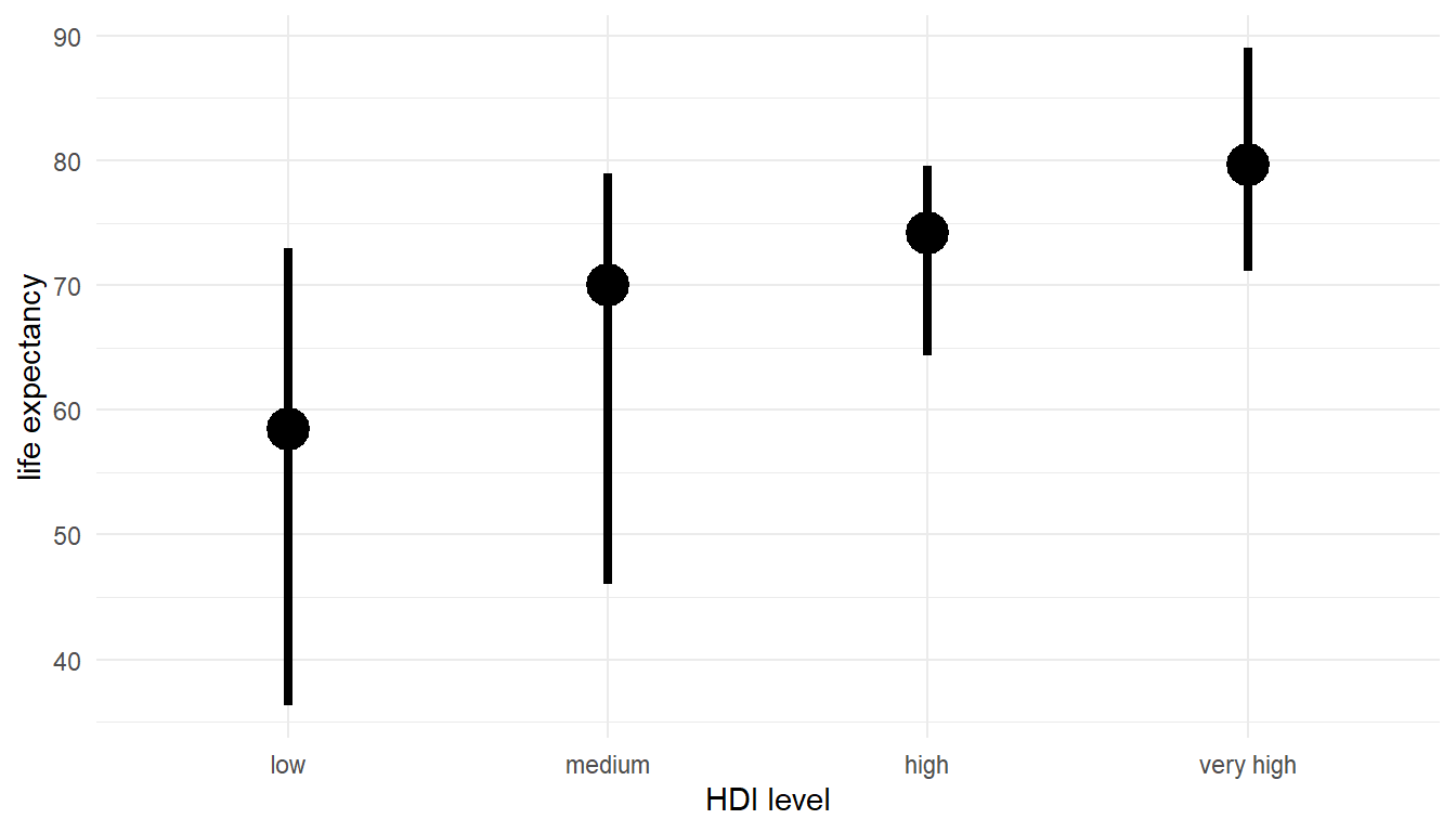
The statistical summary graph we have for HDI level shows a positive relationship between human development index and life expectancy. Adjusting by development status did not make a difference on our relationship. Additionally, the distance between min and max is much shorter than that in expenditure level which indicate a strong relationship and a tighter model fit.
Scatter Plot of Live Expectancy vs Total Health Expenditure and HDI
The scatter plot of live expectancy vs total health expenditure and income composition of resources clearly present what actual model fitting will be in our dataset.
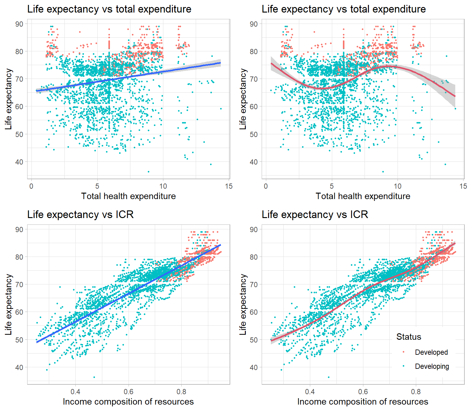
The two plots with two blue straight line on the left is the linear model fitted in each of the relationship. The two plots on the right is the cubic spline model we have, where the red curve is the fitted splines. According to the plots we have for live expectancy vs total health expenditure, the linear model is not very fitted to our data. Spline model could explain more variation and yields better fit but the decreasing trend when total health expenditure is greater than 12.5 may comes from over-fitting on the right-most points. Comparing to what we have in life expectancy vs income composition of resources, a positive linear trend is pretty clear. However, the fitted spline model does not make a big difference than the linear model. We need to further decide which model is better by adjusted R squared since spline model may have a higher adjusted R squared but the cost is over-fitting.
Scatter plot of life expectancy vs HIV/AIDS
HIV/AIDS: Deaths per 1000 live births HIV/AIDS (0-4 years) HDI level: Levels of income composition of resources of countries(‘low’ income composition < 0.55; ‘medium’ income composition 0.55-0.7 ‘high’ income composition 0.7-0.8; ‘very high’ income composition > 0.8).
According to our scatter plot for life expectancy versus HIV/AIDS deaths, we can see a inverse relationship that is quite poisson distributed. As the deaths goes higher, the life expectancy decreases and becomes flat when the HIV/AIDS is above 15. We did have several outliers that in the bottom of the plot that shows low HIV/AIDS but low life expectancy, which means there may be other influential factors in that observation lead to low ages. We also included HID-levels in the plot to group our observations. It shown that high HID level countries having high life expectancy and low HIV/AIDS deaths as the blue dots and purple dots concentrated on the left. Indicating a inverse relationship between HIV/AIDS and HDI and a positive relationship between Life expectancy and HDI exist.
Scatterplot of Life Expectancy vs Adult-Mortality for each level HDI level
Adult Mortality: Adult Mortality Rates of both sexes (probability of dying between 15 and 60 years per 1000 population)
According to the plot we have for Life Expectancy vs Adult-Mortality in 2013. We able to get insight in their relationship, which is a inverse linear relationship. Higher adult Mortality may result in low life expectancy. I grouped each dot(country) by their HDI level in 2013 and controlled the size of the dot by each county’s total health expenditure in 2013. We can see that countries with relatively low adult mortality and high life expectancy tend to have higher health expenditure. Similar to previous scatter-plot result, high HDI countries have lower adult mortality rate. Additionally, according to dots’ size. Countries with higher health expenditure tend to have lower adult mortality rate and high life expectancy. However, We also had country ‘Lesotho’ that spend a lot on health expenditure but failed to reduce adult mortality and increase life expectancy. We may use its lower HDI level to explain the situation.
Line Graph of Life Expectancy vs Income Composition of Resources for each Sub-region Group of Country
In this line graph, we have a line for life expectancy vs income composition of resources for a country. To make the graph clearer, I grouped countries into different sub-region of their continents. We can investigate that, generally, higher income composition of resources result in higher life expectancy in most of the countries. Hence, we might conclude that there is a positive relationship between life expectancy and income composition of resources, which is Human Development Index by this graph. Furthermore, we could also see that region sub-Saharan Africa had low HDI and low life expectancy, which may due to their poverty issues. Regions in Europe and ‘Australia and New Zealand’ had pretty high HDI and high life expectancy. We removed countries ‘Haiti’, ‘United Kingdom of Great Britain and Northern Ireland’, ‘United Republic of Tanzania’, ‘Cote d’Ivoire’, and ‘Republic of Korea’ since their ICR values are imputed as they were missing in data collection.
Line Graph of Life Expectancy vs Total Expenditure for each Sub-region Group of Country
To compare with the line graph we have for HDI, a line graph of total health expenditure versus life expectancy was also made. We cannot see any clear relationship between those two variables, which means health expenditure might be a less effective factor than HDI. Most of the regions having countries that across each level of expenditure. However, countries in sub-Saharan African also had lower life expectancy values.
Stacked Histogram of Schooling by Life Expectancy Levels
Schooling: Number of years of Schooling(years)
The stacked histogram of variable ‘Schooling’ was made. We differed each bar by life expectancy level. According to the plot, countries with high schooling had higher life expectancy level as the color goes darker from left to right. Most of the countries achieve high level of life expectancy when they had more than 10 years of schooling. There is no really big difference between the schooling of the counties with ‘low’ and ‘medium’ life expectancy level. Hence, we may have a weak positive relationship between schooling and life expectancy.
Copyright © 2022, Shiyuan(Eric) Zhou.